
A web logo is usually a small RGB file made to look sharp on a screen. A print-ready logo is a clean vector file that can go large — a sign, a truck, a label, or embroidery — without getting fuzzy, and it’s set up for ink instead of pixels. You need both. One file rarely does both jobs well, so I deliver a logo in the versions and formats you’ll actually use.
I’m Cary Hawkins. I’ve been designing logos for Oklahoma businesses since 2007. The question I hear most isn’t “can you make a logo?” It’s “why won’t this file work for the sign shop?” Usually the answer is that the file was built for a website.
What a web logo is good for
Screens are forgiving. A PNG or SVG at the right size will look crisp on a homepage, a Google Business profile, or a social avatar. Color on a screen is RGB — red, green, and blue light. That’s the right setup for a monitor, and the wrong setup to send straight to a printer.
A web logo also has to stay clear at a small size. Favicons, email signatures, and mobile headers don’t have room for fine detail. SVG stays sharp on a screen when the mark is a true vector. PNG is what most websites and social platforms expect for a transparent background. JPG is a poor choice for a logo that needs a clean edge. None of those, by themselves, is what a sign shop wants to cut from.
What “print-ready” actually means
Print is a different set of physics. I wrote about this years ago in do’s and don’ts of print design, and the same rules show up in logo files.
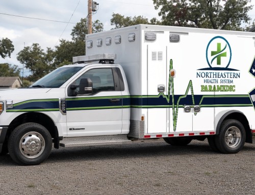
Color in print is usually CMYK — cyan, magenta, yellow, and black ink. A bright RGB blue on your phone can print duller, or shift, once it hits paper or vinyl. A logo that looks fine at 200 pixels wide on a website will look soft on a business card and worse on a truck. That’s why a print-ready logo shouldn’t be a picture if we can help it. It should be a vector: paths and type that can scale from a pen to a wall without jagged edges.
A print-ready file also has the practical stuff handled. Fonts are outlined or packaged, so the shop isn’t missing a typeface. There’s a one-color version for a single-color print run, and a reversed version for dark backgrounds. If the logo is going on a sign, a vehicle, or embroidery, the file has to be clean enough for those processes.
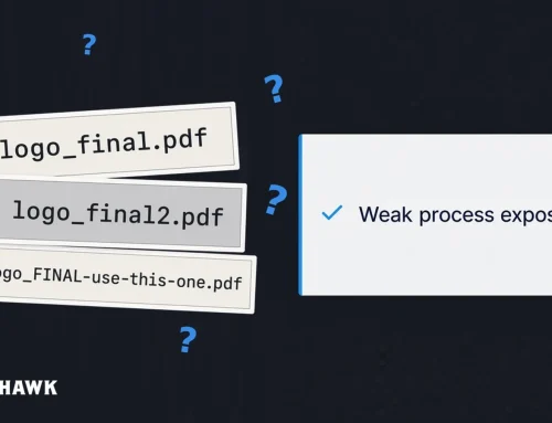
I’ve seen plenty of projects get stuck because nobody could say which file was final — logo_final.pdf, logo_final2.pdf, or logo_FINAL_use-this-one.pdf. A logo pack should make that obvious: here’s the color mark, here’s the one-color mark, here’s the reversed mark, and here are the formats for print and for web.
What I actually hand over
When I design a logo, you don’t just get one image. On my logo design page I describe it this way:
- Original logo concepts, with rounds of revisions
- Full-color, one-color, and reversed versions
- The file formats you’ll need for print, web, signage, and embroidery
- A simple brand guide covering colors and fonts, so the logo looks consistent everywhere
The brand guide keeps you from needing a new designer every time something goes to print. If I’m also building out the identity, that work lives with the branding and brand identity service.
If your current logo is blurry, pixelated, or only exists as a low-resolution JPG, I can recreate it as a clean vector file through my sister service, VectorMaid. Or we can refresh it without losing the recognition you’ve already built. Either way, the goal is a file you can send to a printer, a sign shop, or a web developer without holding your breath.
Where this shows up in real work

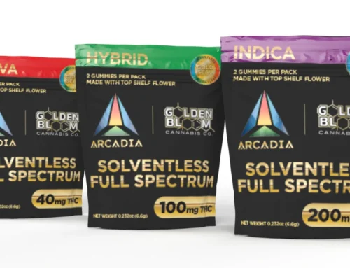
A logo has to live in more than one place. For NetGain Insurance, the work included the logo, then business cards, letterhead, envelopes, flyers, and online documents — print and screen from the same mark. Centurion Companies needed a vector logo and a website. Elk Mountain Partners and EXP309 needed a mark that could hold up in a brand book and on different background colors. Arcadia Brands had to work on packaging, which is a print job with no patience for a soft file.
If all you have is the version from your website, those other uses get expensive. Someone has to rebuild the mark, or the printer has to push a soft file farther than it can go.
Frequently asked questions
Can I just use the PNG from my website for business cards?
You can send it. I wouldn’t. A web PNG is usually too small, in the wrong color mode, and not a vector. You’ll see the difference on the card.
Is a PDF a print-ready logo?
It can be, if the logo inside it is a vector and the colors are set up for print. A PDF that only contains a low-resolution picture is still just a picture. If you’re not sure, send me the file and I’ll tell you what you have.
What if I only have an old JPG?
That’s common. A JPG can be a reference, but it isn’t a print-ready logo. I can redraw it as a clean vector, or we can talk about a refresh if the mark needs work.
Do I need a brand guide for a single logo?
Even a short guide helps. Colors, fonts, and clear-space rules are usually enough to keep the mark consistent on a card, a truck, and a website.
Let’s get you the right files
If you’re not sure what you have — or you need a logo that can survive a sign, a truck, and a website — tell me about the business and where the mark has to show up.
Let’s talk or email artwork@seehawkdesign.com.
— Cary Hawkins, SEEHAWK Design, Edmond, OK