Do’s and Don’ts of Print Design
While they seem similar on the surface, designing for print is in fact a totally different beast than digital design. While you have similar goals and design rules, print has certain restrictions that digital simply doesn’t have. Elements such as size and color are totally affected by the capabilities of your printer, and if you don’t know how these elements will be affected by your printer, you may be disappointed by the results. So how do you get around these problems? The best way is to be prepared, and have the most knowledge you can going into a print design project. Without further ado, here are some basic tips to make sure your print design is the best it can be.
Color
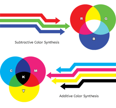
Image from Sumy Designs.
CMYK and RGB
CMYK and RGB are two modes of color. RGB, or Red, Green, and Blue, is what is used for digital displays like computer monitors and TVs. It works great in a digital environment and creates crisp, colorful images. However, trying to convert a great RGB design to CMYK often leads to disappointment.
CMYK, or Cyan Magenta, Yellow, and Key (black), works well for print, but often mutes bright colors like oranges and reds. It also struggles with neon colors like bright green. How do you know whether your colors will print well, then? The first way is to make sure your document is in CMYK. This can be changed easily in Photoshop, Illustrator, and many other similar programs. However, if you don’t have access to such programs, websites such as rgb2cmyk can be a great resource. While these tools are great fixes, the best way to get the image you want is to design in CMYK in the first place. If you must design in RGB, while picking colors in Adobe products, watch out for the caution symbol that sometimes appears between your color selection and the ‘OK/Cancel’ selections
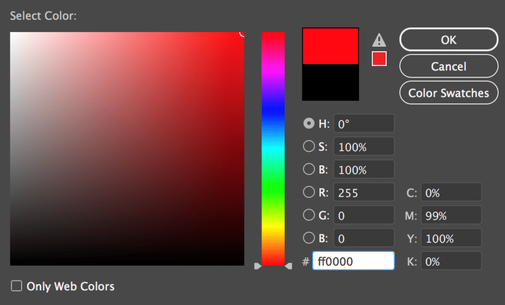
This alerts you that the color you are selecting may not work well in a print environment. If you select the caution symbol, it will attempt to match your current color that will work better for print. While not a perfect solution, this can help you avoid some disappointments.
Spot Colors
But let’s say you’re determined to use that bright red that just won’t print right. There is another solution. You can use spot colors. While most color printing is ‘process’, meaning it’s a mix of the CMYK inks to create the color you want, a spot color is the addition of just that color ink. Wherever you designate a spot color in a document, that color will print. This helps make sure the color is exactly what you want.
There are downsides to spot colors. Digital printers won’t be able to add spot colors, and spot colors will considerably rack up the price of your project. However, if well applied, spot colors can really improve a project.

Fonts
When using unusual fonts, sometimes there can be problems when sending documents to the printers. If the printer does not have the font you used, then their computer will replace this font with something completely different. This can completely change and even ruin your design. Fortunately, there is a solution.

Image from Pexels.
Creating Outlines
While you can easily stick to fonts that every computer has, you’ll probably eventually get tired of Times New Roman. It’s better, then, to convert your fonts to outlines in a vector program, or an image in other programs. This will ensure that the printer will have no problem understanding your font. It won’t see it as a font to replace, and instead it will be just another part of the image.
Fonts to Avoid
There are other things to consider when selecting fonts for prints, of course. You want to avoid overused fonts, or fonts that are now considered out of fashion. It’s an easy way to make sure customers don’t take your print design seriously if you select an awful looking font.
Additionally, make sure your font is readable at the size that you’re printing it at. While you can easily zoom in to read your text on your computer, those looking at the physical version don’t have that luxury (unless they have a magnifying glass on them or something). Just remember where your design will end up and you’ll be fine.
Images
You’ve found the perfect image for your print design. You save it, add it in, and go to print… and it looks awful! What happened? There are a few reasons for this to happen, but all of it ties back to the quality of your image.
Image Resolution
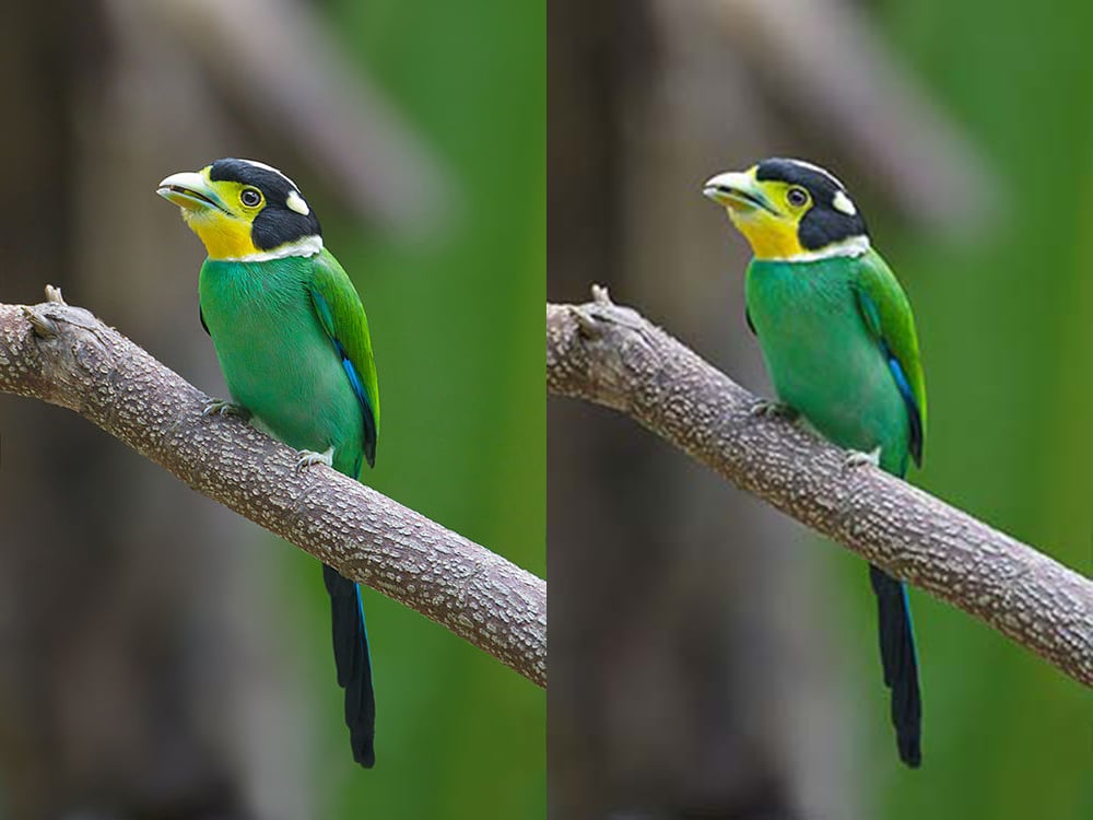
One of the most important elements of print design is the resolution of your image. This relates to the size of your image and the dpi, or dots per inch. Larger images print better than small ones, simply because there’s more detail. The printer doesn’t have to take small details and size them up. The dpi affects this as well. When printing, the printer lays down small dots of ink, and as you can imagine, the dpi is how many of those dots are in an inch.
While a computer monitor can easily handle a small number of dpi (or ppi, in the case of a computer- pixels per inch), a printer requires more dots to print well. 300 is usually understood as the minimum size to receive quality results.

You can double check the image resolution in most programs. However, be advised that simply changing the resolution of a small image usually won’t help- your computer will have to make up detail that wasn’t already there, resulting in the same problem you were already having. The best solution is to already have large, high quality assets from the outset.
File Types
Another way to make sure your image prints well is to make sure you understand different file types, and what works best for print. One of the best file types for print is PDF, or Portable Document Format. Many designs can easily be saved as a PDF, which is high quality and stays high quality.
For images, JPEG, or Joint Photographic Experts Group, can be a great file type. However, if not careful, it can lead to losing image resolution. JPEG images use lossy compression. This means that every time you save a JPEG image, you lose a little bit of image definition. This means that many JPEG images can become compressed, creating low quality images that print terribly. However, when careful to avoid too much compression, JPEG images work great. Lossless image file types, like PNG, or Portable Network Graphics, won’t have compression problem, but JPEG images can have more image definition.
While these are just some basic tips to knowing how to design for print, we hope this helped you get started. Keep designing and researching, and soon you’ll be a print design pro.


