6 Basic Ways to Make Your Website Design More Modern
It can be difficult to keep up with website trends. Website design has rapidly advanced over the years, and with more and more websites competing for traffic on the internet, you need to make sure your website is the best it can be for your consumers.
But what’s the best way to keep up? How do you know what’s really important to your audience, and what will become irrelevant in a few years? First, you can make sure your website adheres to some basic standards. Here are 6 basic ways to make your website design more modern.
Responsive Design

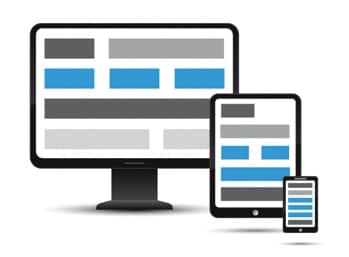
This is one of the most important methods of making your website modern. Responsive design is a way to make sure that when people view your website through different devices, such as phones or tablets as opposed to desktop computers, the website design is still usable. We’ve all visited websites that clearly weren’t designed for a phone in mind, and it’s easy to simply abandon an old website for a newer one meant for a phone.
Not sure how important this is? According to Techjury, nearly 80% of internet usage in 2018 is expected to have been mobile. That’s a lot of people using the internet on their phone— and it’s expected to only go up from here. You want to make sure your website design can meet the demands of modern consumers.
Fortunately, any modern web designer will understand this the importance of this, and website building tools like WordPress and Wix will have the tools to make sure your website is responsive and mobile friendly. This basic step will ensure your website design can keep up with its competitors.
Speed Up Your Site
Another basic trick to make your website design more modern is to get it to load as fast as it can. Load speed is one of the most important ways to make sure people keep using your website. And people are even less patient than you might think—47% of consumers expect a page to load in 2 seconds or less. That’s not a lot of time!
Fortunately, there are some tools you can use to check the speed of your website. Pingdom is a great way to check the speed of your website from different places around the world. That way, you can see whether your website speed is good enough to keep up. And if you use Google Analytics, it has some useful tools to ensure that you can keep track of how fast your website runs.
If your website speed’s not as fast as you hoped, don’t panic. There are some basic ways to increase your speed. Making sure the file sizes of your images aren’t too big is a great first step. You can also remove redundant code from your website, making sure everything is more streamlined. The first step in fixing the problem is knowing about it, so you’re already well on your way.

Less is More
Before, we talked about functionality. Now it’s time to talk about looks. One of the most important things you can do to help your website be good to look at is give it room to breathe. While it’s tempting to throw more and more elements onto your website design to make it exciting, it can become overwhelming. White space not only keeps your website from becoming overwhelming, but also helps your website design look clean and modern.
So, how do you figure out what to take away? Sometimes you don’t need to— you just need to find a better way to organize your information. Adding bigger borders around text and images will help space your website out. You can also remove elements that might make your website seem too ‘busy’, like competing textures or fonts. Consistency and space are key.
Semi-Flat Design

Another way to design your website is to incorporate semi-flat design. Semi-flat design is the use of flat shapes with some realistic elements added back in, like shadows. Semi-flat design was popularized by Apple, and it’s been everywhere ever since. You’ve probably already seen it in a lot of logo redesigns and other website designs. If your website doesn’t have any semi-flat design, it might be worth incorporating.
However, it may not always be good to follow a trend- sometimes it’s more important to maintain your unique identity. Sometimes following trends means you’re always going to be behind. While semi-flat design will certainly make your website seem more modern, make sure you stop and consider whether it’s the best choice for you.
The best way to incorporate semi-flat design is to make sure it matches the needs of your users. As Invision points out, whatever you decide to do, you should ultimately augment the experience of your users. It shouldn’t distract or keep your users from using your website. But, if it’s done well, semi-flat design can make a website be both more modern and a better experience overall.
Videos and Pictures
Videos and pictures can increase the engagement of users by catching their attention. Pictures are a great way to communicate what your website is all about, and makes it a more interesting website design than just a page with text. If you don’t have the budget for your own photography, there are plenty of stock photography websites that you can use to decorate your own.
While pictures are great for catching attention, videos are even better for driving engagement. Videos are one of the biggest ways people are engaging with the internet right now. On YouTube, over 6 billion hours of video are watched each month. And, it creates a great website experience. Website videos can be used to demonstrate products, share expertise, and tell a story.
If you can successfully integrate photos and videos into your website design, it can really elevate your website. However, you must be careful to make sure it doesn’t cause more problems. Images can slow down your website, which means users will leave your website quickly. And nobody likes videos that autoplay—one quick search finds you tons of guides on how to disable autoplay. While adding videos and photos can improve your website design and make it more modern, make sure to not negatively impact other aspects of your website, like usability.

User First
Everything you do to improve your website has to be to improve the experience for your user. User first, or user-centered design, is the best way to make sure that consumers engage positively with your website design.
While there are plenty of ways to turn a quick profit off of a website, like invasive ads and autoplaying videos, these tactics only frustrate users, making them less likely to use your website. You’ve probably left a frustrating website yourself that engaged in these tactics. The number one way to best improve your website and made its design more modern is to ensure that users enjoy using it. Without that, it doesn’t matter if the design is slick or if there are nice videos. People won’t want to use it.
To help fix this, try and figure out which parts of your website people have trouble with, or what parts are less clear than others. What can you do to fix them? Sometimes the solutions will be things we’ve already mentioned in this article, like making your website responsive or ensuring it loads quickly. Think through what a user will do if they’ve never seen your website before.
With these basic tips and tricks, you’re well on your way to making your website design more modern. While modern design is constantly changing, you can never go wrong by making your website more user friendly. If you find this task daunting, SEEHAWK Design is here to assist you in any capacity.


